Sese Skincare
A FICTIONAL
SKINCARE RANGE’S
PACKAGING DESIGN AND SHOPIFY
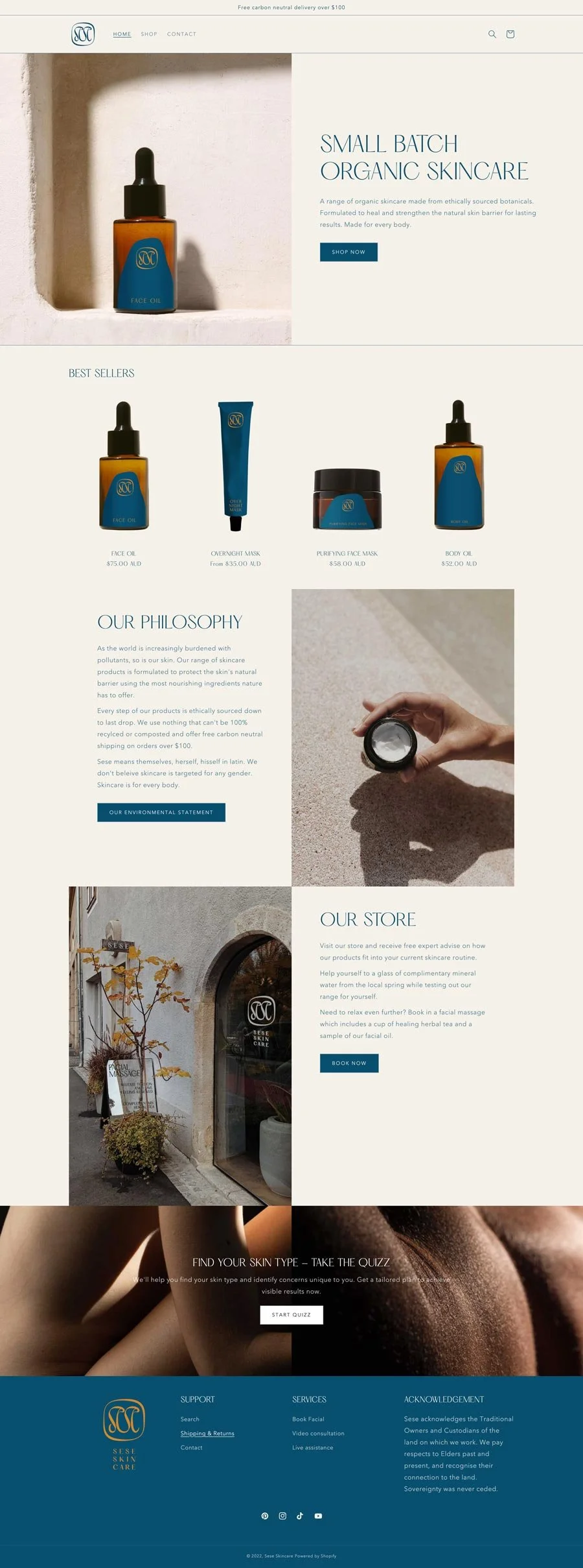
Sese is a skincare range with strong personal values. Elegantly genderless and caring not only for your skin but also the planet.
Sese is the Latin reflexive pronoun for itself, himself, herself, and themselves. Chosen to represent a skincare line that enhances, supports, and cares for the skin rather than changing it. A short yet lyrical name that’s memorable and suits the brand’s persona perfectly.
The organic shape of the label was inspired by lakes and ponds; places of reflection, cleansing, and healing. It also nods to the organic and natural ingredients used throughout the skincare line.


The short name that uses only two letters lends itself perfectly as a monogram icon. Water as an inspiration source can be seen again in the way the letters melt into each other.


For designing and building online stores, we use Shopify.
Shopify is secure and easy to use for both you and your customers.
It’s quickly becoming the industry standard.